


Want to know how to create a color palette that works for your UI? Dive in for tips, inspiration, and an overview of the upcoming trends.
Table of contents
- Color theory basics
- Key principles of creating UI palettes
- Color trends: the classics and the new ones
- Creating your own palette
Color theory basics
Color theory can be overwhelming. And confusing. There is color theory from the point of view of physics and then there is the artists’ perspective. In this article, we are going to focus on the artistic view and discuss color palettes a.k.a. color schemes.
Combining different colors might seem intuitive at first — basically, you just add various hues to the mix and see what works and what doesn’t. Other than that, you can use ready solutions like Canva Pallete Generator to get the color scheme of any photo you like. However, while this might be true in fine arts, it’s much more complicated when a palette is applied to something more utilitarian. In UI, the choice of a color scheme is a crucial step that can either make the final product an absolute hit or a painfully massive miss. Because the key purpose of color in UI is to guide the user easily and intuitively across the interface, there are certain rules in UI color theory that only apply to interface design.
But before we take a deep dive into those, let’s do a quick overview of the key color terms we are going to be using in this article.
Key terms in color theory
We all know words like hue, saturation, contrast, shade, and others. Overall, it’s pretty clear what these mean: if you’ve ever adjusted the color settings of a photo before, you get the idea of what these things are about. Increased saturation makes the image juicier and bolder, and decreased contrast makes it fade and grayish. Changing the hue can turn the entire image pink or any other color, etc. But how, why, and technically speaking, what are all these things?
Color wheel — a circular graphic representation of the color spectrum, where each color is preceded and followed by a hue closest to it. The 12-hue color wheel as we know it today was proposed Johannes Itten, a Swiss painter and writer who taught at the Bauhaus — the famous German art school.
In the 12-hue color wheel, there are 3 primary colors: red, blue, and yellow. Next come the secondary hues: orange, purple, and green. These are the colors you get by mixing red with yellow, red with blue, and blue with yellow respectively. The rest of the hues are tertiary since they are the result of mixing secondary hues with primary colors. These include orange-red, yellow-orange, yellow-green, blue-green, blue-purple, and blue-red.
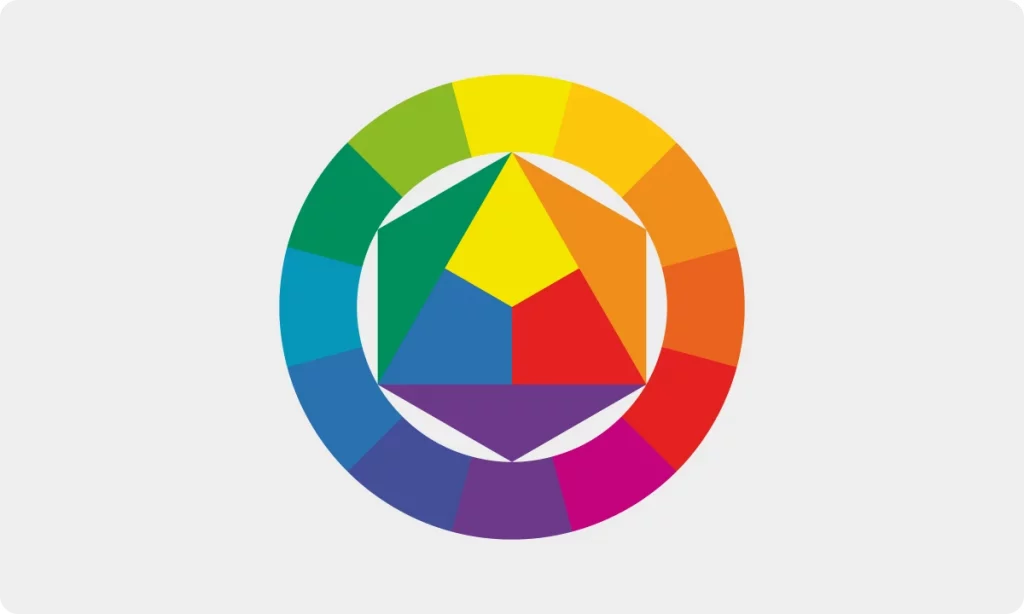
There is a convenient way to memorize the placement of hues on the wheel. Basically, it’s a rainbow in a circular shape so the colors go in the same order: red, orange, yellow, green, blue, indigo, violet. Together, their abbreviations are ROYGBIV which kind of looks like a gentleman’s name — Roy G. Biv. Plus, you can always create your own phrase to remember the order of the colors: for instance, our version is Rather Odd You Gave Birth In Virginia.
Color harmony — a visually pleasing, balanced combination of colors based on the color wheel.
Color — the most general term used to describe different hues, shades, tints, and tones. This is the term people normally use when referring to different points on the color wheel. You can use the word color to describe anything from a general name for a color family (green, orange, yellow) to a specific shade like navy blue, dusty rose, or brick red.
Hue — the term used to refer to an entire color family. Red, blue, and yellow are the primary hues on the color wheel. Orange, purple, and green are secondary hues, since you get these by mixing the primary ones. Tertiary hues include orange-red, yellow-orange, yellow-green, blue-green, blue-purple, and blue-red. Other colors are various shades, tints, and tones of these main hues.
Tint — a mix of a hue or a color with only white. Technically, pastel colors like baby pink, baby blue, and lavender are tints because they are all the result of mixing the main hues with white. Essentially, any soft, milky, pastel shade is a tint of one of the 12 core hues.
Shade — a mix of a hue or a color with only black. Whenever you darken a hue using black, you get a shade of this color. Colors like navy blue, maroon, and dark chocolate are shades, since they are what you get when mixing blue, red, and brown with black.
Tone — a mix of a hue or a color with only gray. Dusty, muted colors like sage, denim blue, and mauve are examples of tones.
Contrast — the difference between various hues. To put it simply, if you pick a hue on the color wheel, the one that is directly opposite it will create the highest visual contrast. The closer the colors are to each other on the color wheel, the less visual contrast you’ll get when combining them.
There is also the tonal contrast which is the difference between the lightest and darkest tones in a composition. You can check your tonal contrast in grayscale, and it’s a crucial step in creating the color scheme for your design.
Temperature — our perception of the colors as warm or cool. Colors that have a more prominent red or yellow undertone are perceived as warm while those with stronger blue or green undertones are seen as cool.
Neutral colors — hues that are not on the color wheel and can be used as supporting colors. If you look at the color wheel, grays, whites, browns, and blacks are not on it — these are the four groups of hues that make up the neutrals. Because they are perceived as hues that lack color compared to the main shades from the color wheel, they can be a non-overbearing addition to an already vibrant color palette. Neutrals can be paired with any other hue from the color wheel.
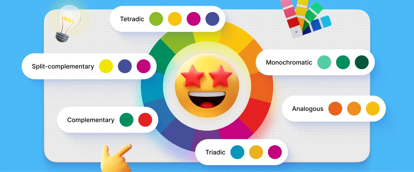
Types of color harmonies
As we mentioned earlier, color harmonies, a.k.a. color palettes, are usually based on the placement of the hues on the color wheel. The easiest way to pick colors that go well together is to take the two opposing hues, like yellow and purple. However, this is not the only option and is not even the most visually appealing one. There are at least 5 more basic types of color harmonies you can get using the wheel.
Monochromatic
This is the safest, most straightforward way to build a color palette. You take one primary hue and use all its tints, shades, and tones to create a color scheme.
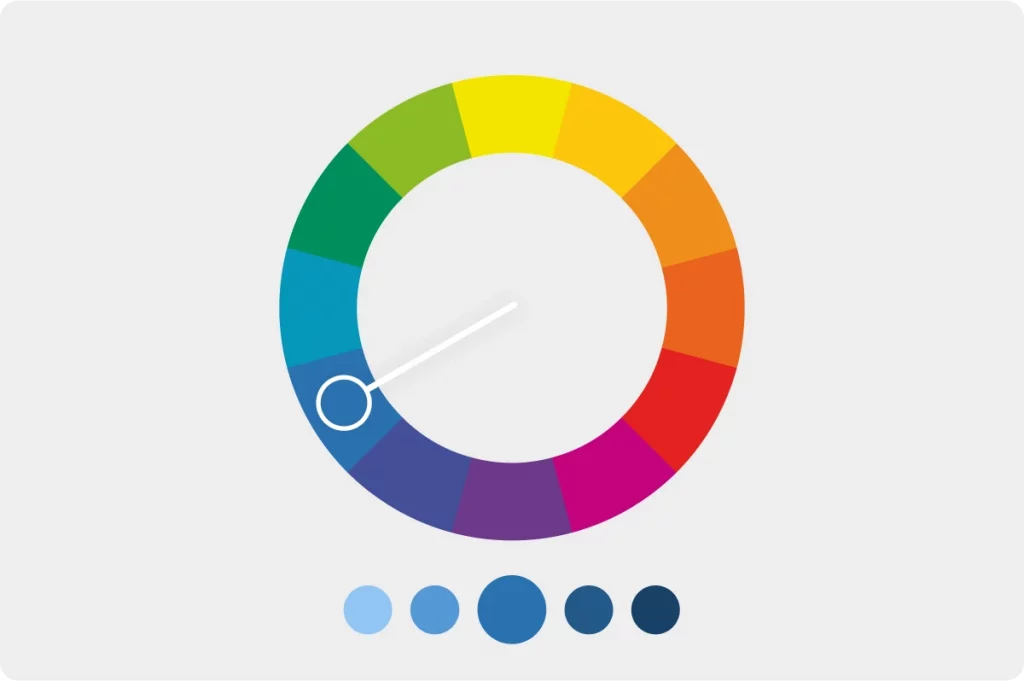
For instance, if you’re going for something fun and eye-catching, you can take pink with all its variations, from baby pink to dark fuchsia and beyond. This way, you can use tones for bigger elements that should be non-overwhelming and comfortable to look at, shades for smaller elements that need to grab the users’ attention, and so on.
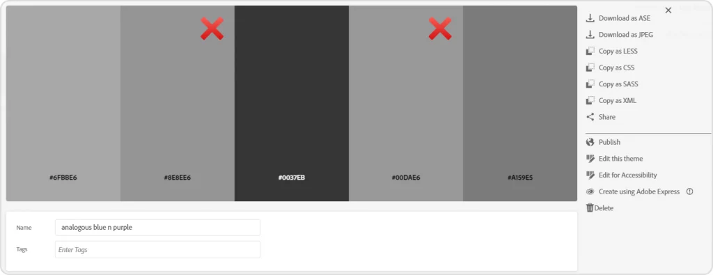
Analogous
An analogous color palette would be ideal if you’re going for a colorful scheme but don’t want to overdo it. It is made using 3 hues next to each other on the color wheel. This way, you get enough visual variety, yet the colors are not all over the place and look harmonious.
Examples of analogous palettes include pink-purple-blue color schemes, yellow-orange-red color harmonies, and others. Sometimes, an analogous palette can include more than 3 neighboring colors.
Complementary
The most well-known color coordination formula is the use of two complementary colors. These are the two hues that are directly opposite each other.
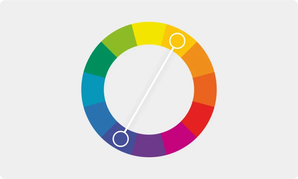
Complementary color palettes are bold and contrasty, but they can also be a bit too intense. Using neutrals along with the two complementary colors makes a perfectly balanced color scheme.

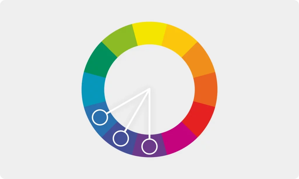
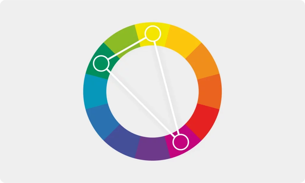
Triadic
In case you want something a little more visually complex but not too crazy, a triadic palette is an ideal choice. It is based on three colors that have an equal distance between one another.

One of the most popular triadic combos is blue-red-yellow.

Tetradic
This palette is built on the same principle as the previous one, except here, you have 4 colors that have the same distance between one another.
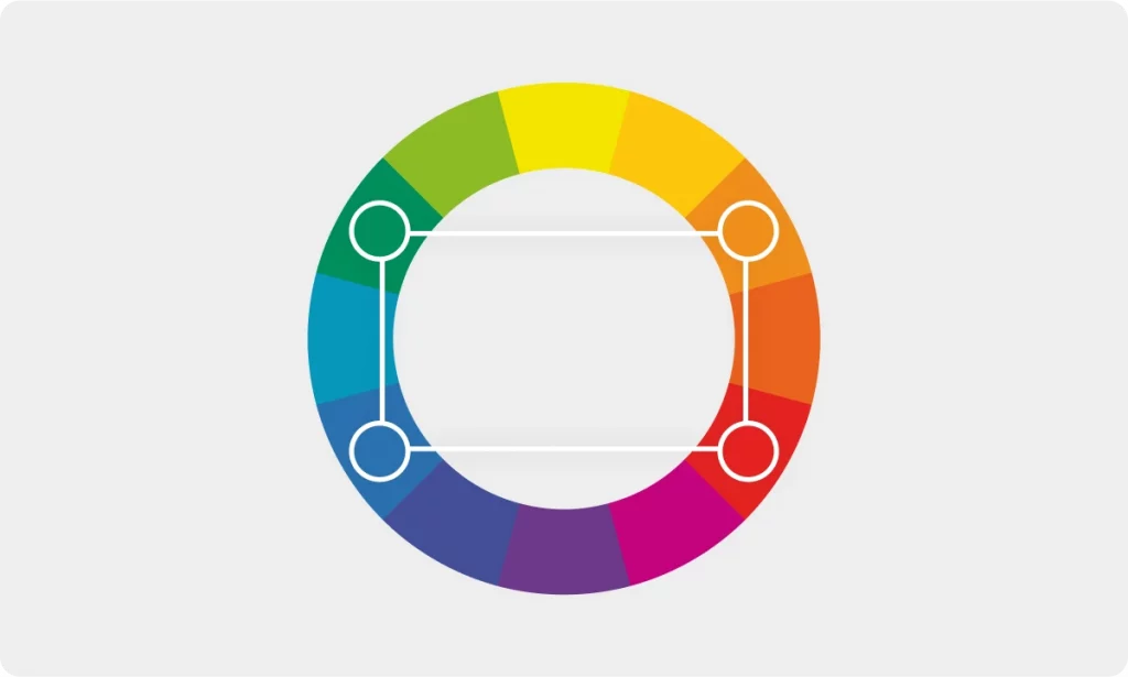
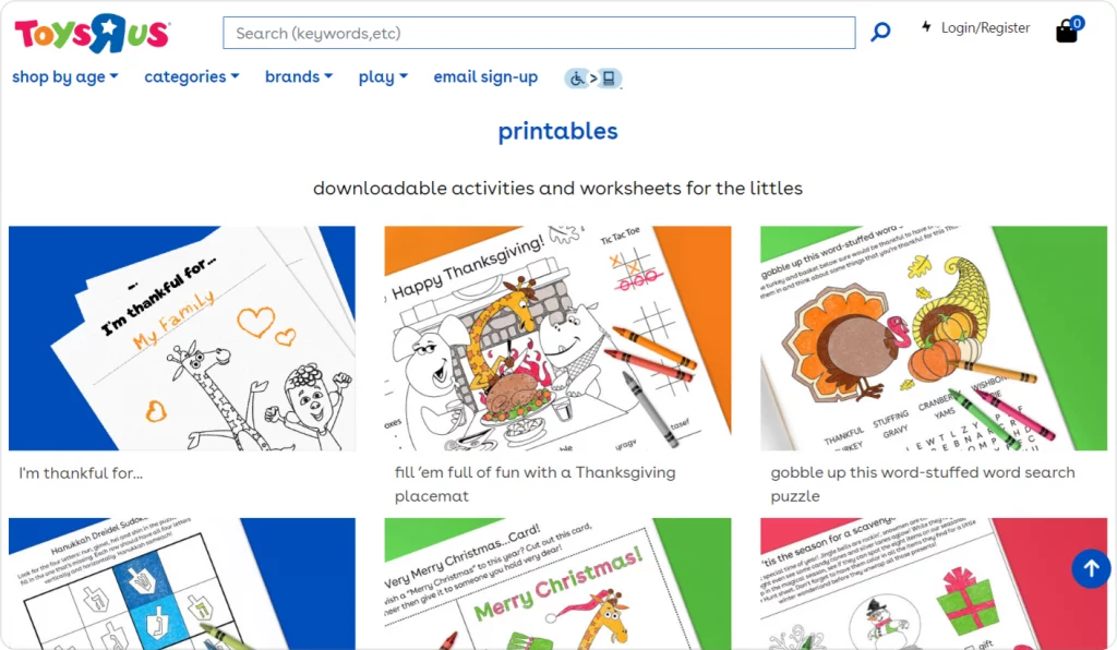
If you stick to more saturated hues when creating a tetradic palette, it can be visually intense. This, however, works for brands that are meant to be fun, bold, and energetic. A good example of a brand that makes perfect use of a vibrant tetradic palette is Toys “R” Us — the world’s most well-known kids’ store.
Split complementary
Remember the complementary palette where you take the two opposing colors? Now imagine that instead of picking one opposing hue, you take two hues that are right next to it. That would be a split complementary color scheme.
For instance, if we take purple with a split complementary palette, instead of picking yellow, we’d choose yellow-green and yellow-orange.
Meaning of color in design
Aside from supporting your brand image, colors in UI can be used to evoke specific emotions. Color meanings can be a helpful guideline when choosing the main hues for your design. Depending on the industry a company is part of, its target audience, and the aim of the website or application, certain colors might work better than others. The primary hue will set the mood and create a certain vibe your design will give off.
Though we all have our unique associations with every shade, research on psychology of color demonstrates that people tend to link each hue to particular characteristics. You can read more about people’s perception of different hues here and here. In this section, we are going to name a few of the most common associations for each color.
Black
Black is sophisticated, elegant, expensive, and chic. Thanks to these associations, this color is often used in the fashion and beauty industries. To some, it also means power, reliability, and security, which is why software developers and tech companies frequently use it, too. In UI design, pure pitch black is frequently replaced with lighter shades like deep navy, dark gray, and other almost-black hues. This way, it’s more visually appealing and less straining for the eyes.
White
White is clean, honest, and comforting. Thanks to these characteristics, white is one of the go-to shades for companies selling self-care and health-related products. Though white is a universally convenient shade for all kinds of UI backgrounds. It makes a perfect non-overwhelming canvas where you can easily place other elements without turning your design into a visual mess.

Gray
Gray is intelligent, elegant, and balanced. Though some think gray looks plain and boring, this shade can be a perfect UI choice. It’s non-overbearing and easy to pair with the rest of the colors. Plus, depending on how warm or cool and how light or dark your gray is, it can create an entirely different vibe. This shade works especially well with blocky minimalist brutalism-inspired designs.

Brown
Brown is stable, comforting, down-to-earth, and reliable. In general, brown is a perfect neutral color that can be both a visually pleasing main hue and a non-overwhelming supporting hue. Warmer, deeper browns evoke a sense of serenity and comfort since they are reminiscent of the color of wood, clay, nuts, hot chocolate, and other things we find soothing. Darker deep browns can be associated with luxury, strength, intelligence, and confidence. Some of the most expensive woods in the world are dark brown: Gaboon ebony, African blackwood, ziricote. Plus, it’s the color of rich, high-quality black coffee and dark chocolate — things we associate with exquisite taste and wealth.

Blue
Blue is clean, fresh, and calm. You can see blue all across hygiene products since blue is associated with purity. Another common group of associations linked to this shade includes intelligence, stability, trustworthiness, and logic. This is why it’s used by every other tech company in the world from Meta to Intel and beyond.
Red
Red is energetic, passionate, dominant, loud, youthful, bold, and creative. This hue is not for the shy ones — it’s a statement and an attention-grabber. It’s a color used across a wide variety of industries, from fast-food chains to automotive engineering. In UI design, excessive use of red can be irritating to the viewer because of how bold and overbearing the color is. Reds should be paired with neutrals for a better user experience.
Plus, red is traditionally associated with error messages and warnings in UI. Whenever an action fails to complete or something goes wrong, the warning that pops up is bright red most of the time. This is why red might be not that great of a choice for CTA buttons and messages that have the opposite meaning and are supposed to be inviting and encouraging.
Green
Green is eco-friendly, healthy, natural, and comforting. No wonder many food companies, health product manufacturers, and veterinarian brands use green. This shade is what we all associate Mother Nature with. Aside from that, green is perceived as fresh, innovative, and trustworthy.
Another thing to keep in mind when using green is that this shade is usually linked to action completion in UI. Whenever you do something successfully, you see a green checkmark with a quick message like ‘login successful’, ‘order placed’, ‘form submitted’, etc. That said, be mindful when using green outside this context in your UI.
Yellow
Yellow is fun, optimistic, happy, warm, and creative. Because yellow is on the bubblier side of the color spectrum, it is rarely used for highly formal UIs. Note, however, that because yellow is vibrant and luminous, it can be hard to look at for a long period of time. This is why in UI design, artists often lean towards muted, darker shades of yellow or conversely, the softer, milkier pastel hues like vanilla yellow.

Also, just like red and green, yellow is a common color for warning messages. Yellow is often used to indicate a weak password, an incomplete response, and other non-critical yet potentially harmful actions. Because of this association with doubt and insufficiency, yellow might not be the ideal choice for major CTAs.
Orange
Orange is creative, energetic, fun, confident, and friendly. As warm and vibrant as yellow and as bold and dynamic as red, orange is an incredibly visually attractive shade. Lately, warm, muted, retro-inspired shades of orange have been trending in UI. They instantly make any design more lively and juicy and work well with a surprisingly wide range of colors. Brighter, more luminous shades of orange can be exhausting for the eye, though they are perfect as accent UI shades.

Pink
Pink is playful, joyful, quirky, energetic. More luminous, vibrant shades of pink are some of the most daring colors you can use in UI design. Shades like hot pink are powerful attention-grabbers that instantly make a design pop. Softer, lighter shades like baby pink are less painful to look at and easier to work with. They, however, carry a different meaning: these hues are perceived as feminine, delicate, and nurturing.
Purple
Purple is sophisticated, creative, mysterious, and unconventional. Deeper, cooler shades of purple and violet can also be associated with wisdom, intelligence, and loyalty. Lighter, warmer purple hues are perceived as imaginative, extravagant, and even magical. Pastel hues like lavender evoke a sense of comfort and tranquility. Purple is not the easiest color to work with, but designs that implement violet and purple always stand out.
Key principles of creating UI palettes
There’s a carefully calculated design formula behind every aesthetically pleasing UI you see. While some principles apply to every other sphere of graphic design, there are some tricks that only work in UI design.
The 60-30-10 rule
The 60-30-10 rule refers to the distribution of color in your palette. Your primary hue should take up about 60% of the composition. 30% goes to your secondary hue that complements the primary color and makes smaller UI elements pop. The remaining 10% should be your accent colors, since most of the time, these are the brightest, most in-your-face hues that would look too insane if they took up half the space.
If your palette does not include black and white, you can add these on top of the main hues. Since technically, these two are not even colors, they can be the exception from the 60-30-10 rule. Your design is not going to be ruined if you add black or white as your text color.
Keep both brand identity and functionality in mind
A UI palette is a reflection of a brand it serves before anything else. This is why when creating a website or app, you need to consider the signature brand colors and start from there. Plus, a brand’s vision can help you decide what type of color harmony would work best. Is it a brand that is all about minimalism and clarity? A monochromatic palette could be the best choice. Is it a fun, quirky brand that is loud and bold? You can go for a vibrant neon tetradic color scheme.
One more thing to consider is the type of website or app you are creating for that brand. There can be a huge difference between the color scheme of the brand’s main site and, say, its online store. In the first case, you’d need to put an emphasis on the main color of the brand and focus on the brand aesthetic when choosing fonts, layouts, buttons, and other elements. In the second case, you might want to use a plain white background with the brand color only at the top and the bottom of the page to make the store easier and quicker to use.
Keep the role of a hue in UI consistent
Did you choose magenta for your CTA buttons? Amazing choice! Magenta is a perfect attention-grabber and an irresistibly alluring color. Are you planning to choose magenta for the sidebar background as well? Think twice before doing that because this way you’re going to instantly decrease the significance of this color in UI. This is going to take away from the excitement magenta evokes when seen on CTA buttons. Note that once you use this exact same color as a background hue it’s going to become the average Joe of your palette. As a result, anything magenta-colored is going to be perceived as non-essential and non-urgent because it’s just one of the background colors.
Accent colors should only be kept for special, niche actions and messages to keep the user intrigued when seeing them. Remember that non-verbal visual cues like shapes and colors are perceived faster than any text, so avoid confusion at all costs and pick your colors carefully.
Check your contrast in grayscale
Contrast is crucial for legibility. Everyone’s screen and brightness settings are different, making the viewing experience of each user unique. Needless to say, there are individual differences in color perception, and we’re not talking about color blindness here (not yet). That said, while your composition might look readable to you, it might look like a barely readable mess to others. To avoid this, you need to make sure that neighboring colors in your UI design have enough contrast. This can be hard to tell in color and that’s where grayscale comes to the rescue.
When you convert your design to grayscale, the tonal contrast we mentioned in the very beginning becomes visible. You can check how the lightness/darkness parameters of the hues in your composition compare. This helps you see if there is not enough difference between the two colors that are right next to each other, possibly blending the shapes into one weird blob.
As soon as the grayscale map of your design looks legible enough, your colored version is good to go.
Check the accessibility of your design
Aside from checking the overall readability of your design, you need to check its accessibility (read more about it here) to account for users with visual impairments. While WCAG 2 is still the standard in accessibility checking, there is a newer, more advanced method of estimating the readability of your content — APCA. Accessible Perceptual Contrast Algorithm is a more accurate way to approximate a real human’s perception of contrast.
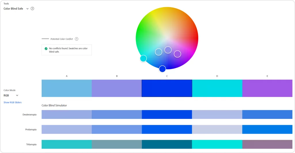
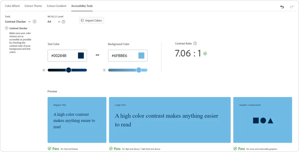
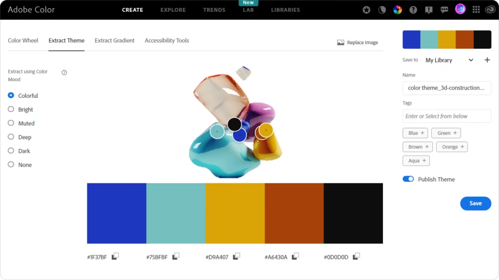
If you don’t want to get too technical, there are numerous solid online tools you can use to check whether your color scheme is colorblind-safe. For instance, with Adobe Color, you can create a palette or extract one from an image and check it in the Accessibility Tools tab. The checker will show you what your color scheme is going to look like from a colorblind user’s point of view and highlight any conflicting shades you might need to tweak.
In that same tab, you can check the contrast between your background hue and your text color to make sure your text is legible.
Color trends: the classics and the new ones
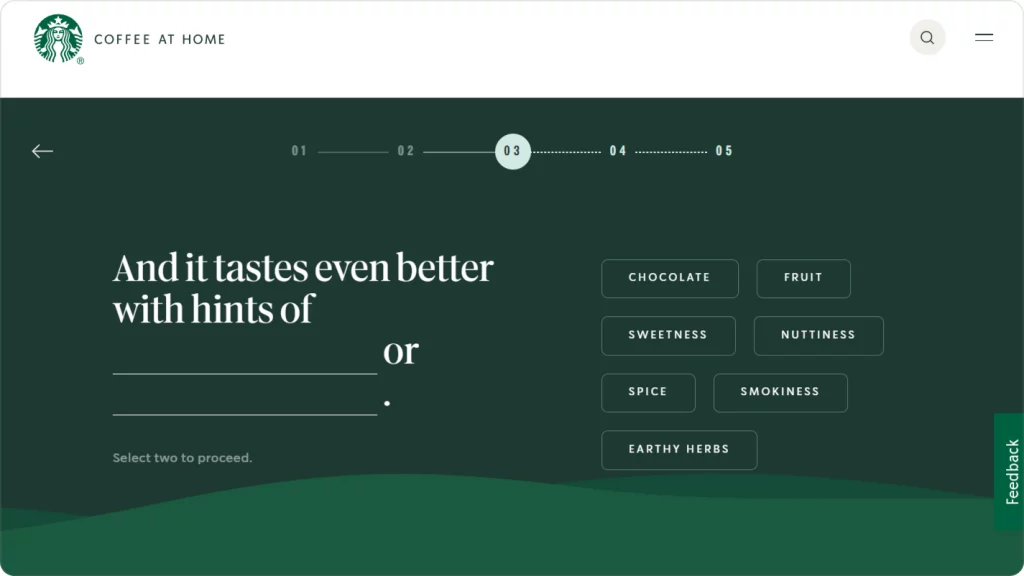
Though minimalism is still going strong, in 2023 we’ve seen plenty of maximalist UI designs. Custom cursors, animated elements, 3D objects, and interactive scrolls that almost feel like Y2K all over again are taking over. Retro-inspired designs with curvy, funky fonts and muted colors are still trending, too. Here are some of the most prominent 2023 design trends that are likely to live on in 2024.
Bold colors
While pastels and earth tones are still extremely common in UI, bolder, more daring color schemes are regaining popularity. Jewel tones and fluorescent hues can be hard to tame, but they instantly make a design more lively and help it stand out. While they don’t work for every brand and every app out there, you can implement bolder hues by using them for accent elements like CTA buttons.
Lately, there has been a vibrant palette renaissance happening in UI and we’re only going to see more colorful color schemes in 2024.
Dark mode
At this point, many users see dark mode as a must for any app, even if its default UI is light. Some prefer dark interfaces because they scroll a lot while in bed at night when the white screen feels excruciating to look at. Others say dark screens feel more comfortable to the eye since the luminance of a light theme is more straining. Plus, because the device doesn’t have to emit as much light in dark mode as it does in light mode, it can prolong battery life.
Whatever the reason behind the big love for dark interfaces is, low-luminance UIs are both a sleek-looking and a trendy option. Needless to say, any color accent placed on top of a dark theme is going to look 100x bolder and juicier.

Gradients
Gradients made a grand comeback after Instagram changed its logo to the iconic yellow-red-pink-purple gradient. Aside from the traditional radial, linear, and conic gradients, there are now complex gradients like mesh gradients, shape blurs, multiple gradients, and others. UI designers use them as backgrounds, shape fills, text effects, and pretty much everywhere else they can. Gradients are an aesthetically pleasing and subtle way to add more color to the composition without overloading it.
If you want to know more about the types of gradients in graphic design and how to use them, check out our in-depth guide on gradients.
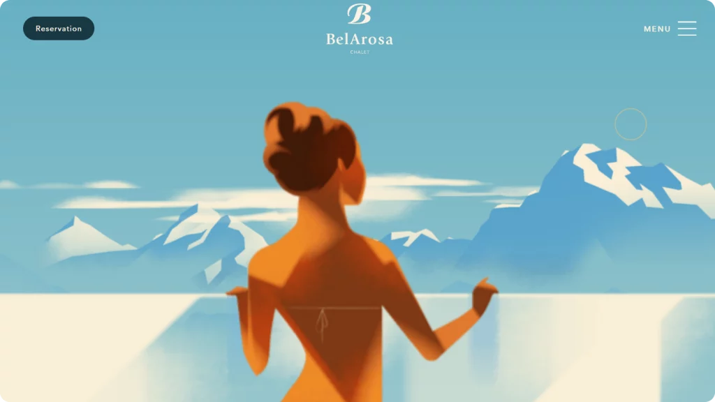
Retro-inspired color schemes
Moody grayish color harmonies of the 1920s, muted warm-tone palettes inspired by the 1960-1970s, contrasty neon color schemes of the 1980s, and more — all these are being reimagined in modern UI. Vintage palettes are a pretty much faultless way to turn any UI into eye candy. Paired with vintage fonts and illustrations, retro palettes can be incredibly alluring and stylish.
By using a retro palette, you can reinforce the brand’s message and make its vision crystal clear to the user from the first glance. BelArosa Chalet’s website is a great example of the smart use of a 1920s Art Deco-inspired UI design. The palette and the illustrations give a luxurious feel and instantly remind us of the sophisticated 1920s fashion. This reflects the brand identity perfectly since BelArosa is a luxury Swiss chalet only wealthy guests can afford.
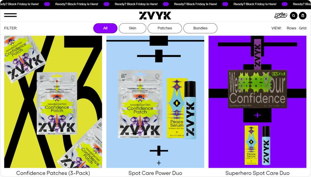
Neubrutalism
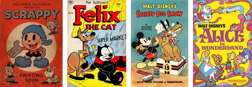
Neubrutalism or neo-brutalism is probably the biggest and the most prominent trend in 2023 UI design. Inspired by the brutalist graphic design of the 1950s, the new brutalism is all about clear shapes, basic geometry, and flat, solid colors. Though, unlike the original brutalist designs, neubrutalism experiments with curvier shapes, funkier fonts, and brighter colors. Imagine a crossover between the actual brutalist/Bauhaus graphic design and cartoon illustration of the 1920s—1950s — that would be the best way to describe neobrutalism.
The flat, contrasty look neubrutalist designs have make them easy to navigate. Layouts like these are perfectly readable, non-overbearing, and most importantly, they load fast unlike designs with 3D elements or animated gradient shapes.
Creating your own palette
With so many different options to choose from, choosing one color scheme seems like an impossible task. It can be insanely difficult to decide where to start, how many colors to pick, what hue will be the primary one, and so on. If you are feeling a bit lost, you can start by creating a palette using a palette generator.
Palette generators
There are tons of different color scheme generators online. Some can give you infinite numbers of randomized color palettes you can tweak and fine-tune manually. Others will allow you to extract palettes from images. Plus, there are palette libraries where you can browse color schemes created by other users.
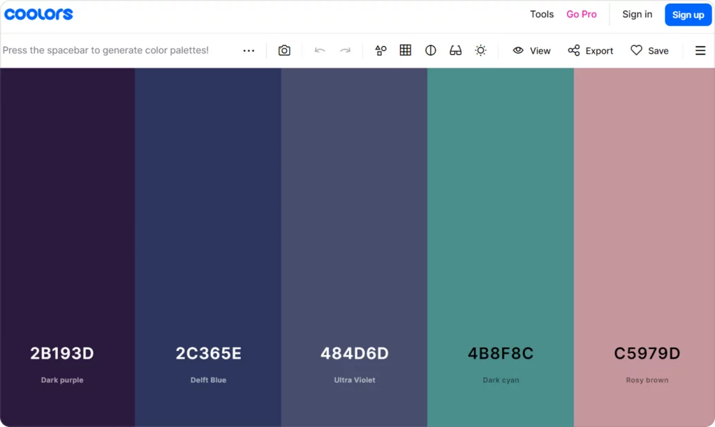
Coolors
With Coolors, you can create random color combos, edit them manually, and check the palette for colorblind-friendliness and contrast. You can also take a look at the library of premade color schemes and save them as they are or edit them further using the generator.
Adobe Color
Adobe Color is one of the most convenient tools for creating color palettes. You can choose the type of color harmony you want (monochromatic, analogous, etc.) and pick the colors from the color wheel. Or you can upload a picture and let Adobe extract hues from it to create a color scheme. Then you can use its Accessibility Tools to check your palette and adjust it if needed.
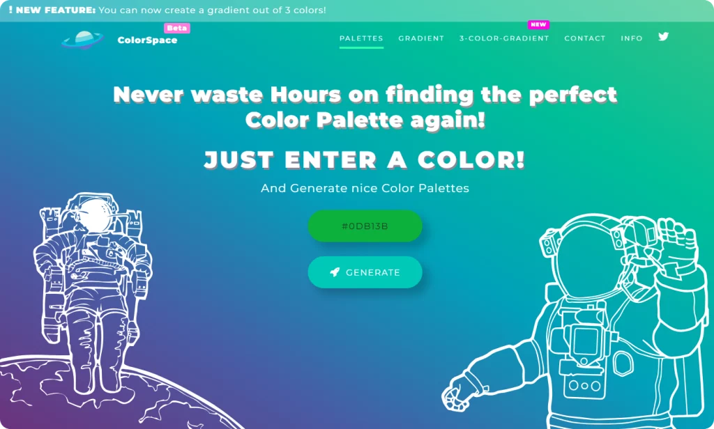
ColorSpace
ColorSpace is the easiest and fastest palette generator to work with. All you need to do is pick a hue to start with on the color wheel and click Generate. The tool will generate 25 different color palettes based on this color for you. With ColorSpace, you can also generate 2- or 3-color CSS gradients.
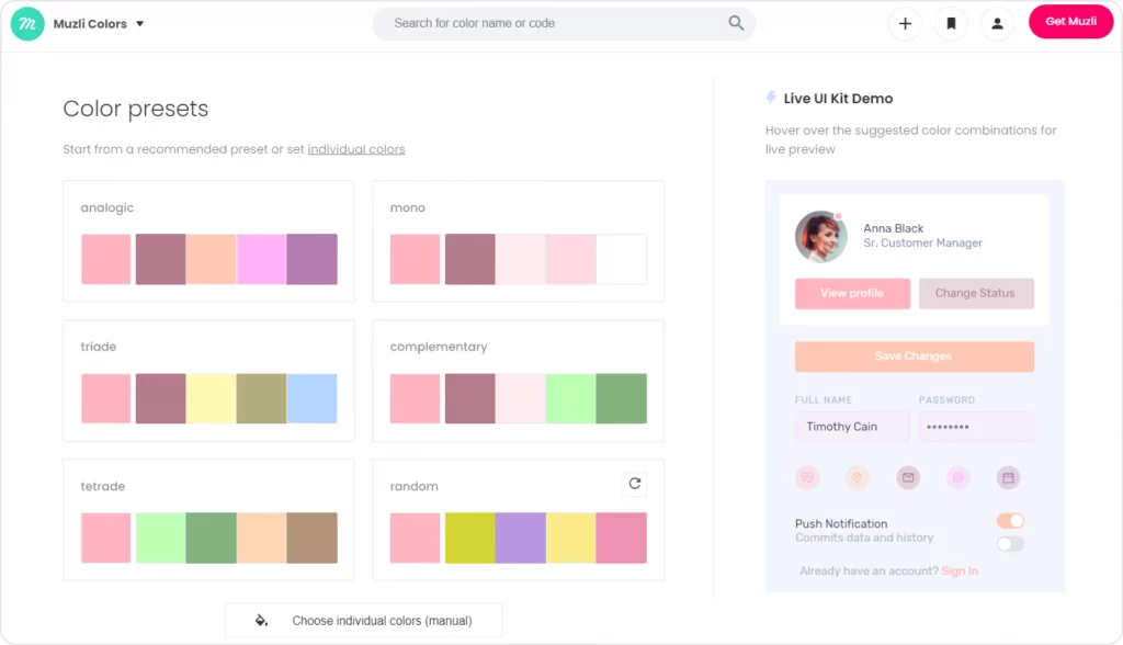
Muzli Colors
Muzli is like a blend of ColorSpace and Adobe Color. You can choose a ready-made palette, create a new one based on an image, or select a hue and let the tool pick the rest of the colors for you. You can test the palette out in real time with the Live UI Kit Demo and adjust the colors manually. The only major disadvantage of Muzli is that you can’t check the contrast or accessibility of your color scheme.
Apps for UI design
You can build a palette from scratch or use a random palette generator inside your preferred design tool, too. Just make sure you check the color scheme with one of the accessibility tools once you select your perfect palette.
Figma
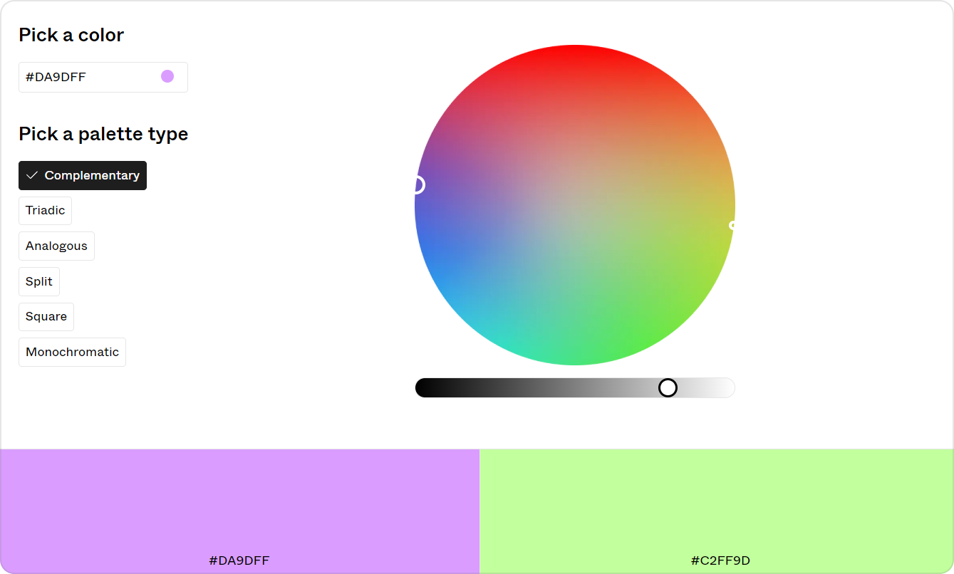
Figma is famous for its ever-growing collection of plugins. You can find a plugin or two for even the most ridiculously specific tasks. There are several color palette generators you can find among the Figma Community plugins. The first one is Figma’s color wheel. You can pick any hue on the color wheel and choose the palette type and the plugin will calculate the color scheme for you. Aside from this palette generator, there are more free plugins like AI Color Palette Generator, Colorinspo, and others.
Sketch
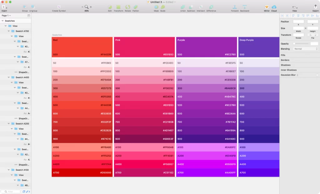
One of the OG apps for UI/UX design and still some users’ favorite, Sketch doesn’t have a native palette generator but you can get one as a plugin. Plus, colorwork-wise, Sketch has a pretty neat feature: along with sRGB, it supports Display P3. This color profile makes it possible to design for devices with Wide Gamut displays, like the latest Mac and iPhone devices. Display P3 about 25% wider than the color range offered by sRGB, which allows you to create juicier palettes. On the downside, a P3 palette is not suitable for web design.
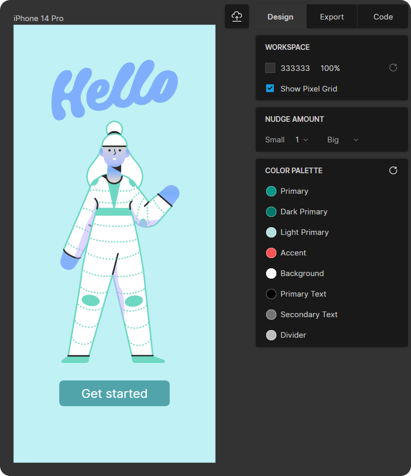
Lunacy
When you want to have the best of both worlds without compromising, Lunacy is there to save the day. Like Sketch, it is a desktop application where you can have Figma’s online collaboration features to view and edit documents on the go with your teammates. Lunacy has a built-in palette generator to help you pick balanced color combinations for your design. All you need to do to get a ready-made color palette is select an element to drop onto the canvas or create a frame. In the Design tab on the right, you’ll see a random color palette at the bottom. You can click the Refresh button as many times as you wish to get a new random color combination or remove the hues you don’t need to adjust the palette.
If you’re not sure where to begin, you can always start by browsing projects similar to yours on Behance, Dribbble, Figma Community, and other platforms for designers. This way you can get an idea of which color schemes are the most popular in the industry you are creating the design for, which hues are trending, and which color combos you personally like the most. Some of the projects are free to download, which is a perfect opportunity to experiment with color settings without having to create a bunch of mockups first.