Maximalism might be making a comeback, but minimalism is still dominating the UI design. Here is how you can embrace it in your UI.
Benefits of using simple backgrounds in web design and app design
Ever noticed how every other website and mobile application has a plain background instead of a cluttered one? That’s no wonder – a crazy background image with loads of fine details, vivid colors, and animations is irritating and does not make the viewing experience any better. A simple background, on the other hand, has numerous perks, making it a perfect choice for UX/UI design.
1. Readability
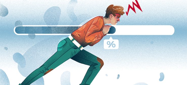
We bet you closed a browser tab after seeing a nearly unreadable, blindingly colorful webpage at least once. Maximalist layouts and color schemes can be too overbearing in app or web design. This is especially true for web platforms and apps that users are likely to use often, with each session lasting a little longer than the average 1.5 minutes.
Maximalist backgrounds can be a good choice for brands that are famous for their bold, over-the-top aesthetic. Other than that, a minimal design is a smarter option. Minimal background designs are pretty much mandatory when it comes to utilitarian websites (e-store, online banking, job search platform, etc.) A bright, detail-heavy backdrop would mess with readability and make it more difficult for a user to interact with the website and find what they came for. A simple background makes each element perfectly legible and enhances user experience.

2. Loading speed
Sure, a 6000×3500 px high-quality photo looks amazingly crisp, but there is no way an image this enormous loads well on every device. Internet speeds vary significantly across different countries, Internet providers, and even devices. A well-thought background has a reasonable loading time, even with a poor connection.
If a website loads slowly, many users won’t hesitate to close it and try another one instead. A webpage that opens quickly and without any weird interface issues like broken pictures and misplaced texts is the way to go.
3. Convenient for placing UI elements
No background is easier to work with than a simple one. Whatever you place on top of it is going to look good without overloading the design. A simple background allows you to play with colors for other UI elements and make buttons and text links more vibrant.
Plus, a simple background image makes it possible to experiment with the shapes of UI elements and their distribution. With a simple background, it’s easier to make the design fun without weighing it down visually.
With a simple background, even animated elements look lightweight and non-overwhelming. Small, subtle animations make the design more alive and interactive.
4. Helps the users focus on more important elements
What is the ultimate goal of any website or mobile app? It’s probably not getting users to adore a pretty UI design – instead, the aim is to get them to take action. Whether it’s subscribing to a service, purchasing a product, creating an account, or something else, UI design needs to shift a user’s attention toward this desired step.
Principles of creating a simple background
In short, a good background is the one that enhances your design instead of distracting the user from its main elements. It sets the mood and gives a user an idea of what they might expect to see in an app or on a website. To make sure it checks these two major boxes, here are some principles of background design to keep in mind:
1. Brand aesthetic-oriented
There is nothing more confusing than a website or an app that feels completely out of place for a brand. As cool and trendy as some designs might be, they don’t go well with every single website. Imagine a brand that is known for their funky vibrant style suddenly going into the clean black-gray-white mode. Brand aesthetic and signature visual style should be the starting point in UI design.
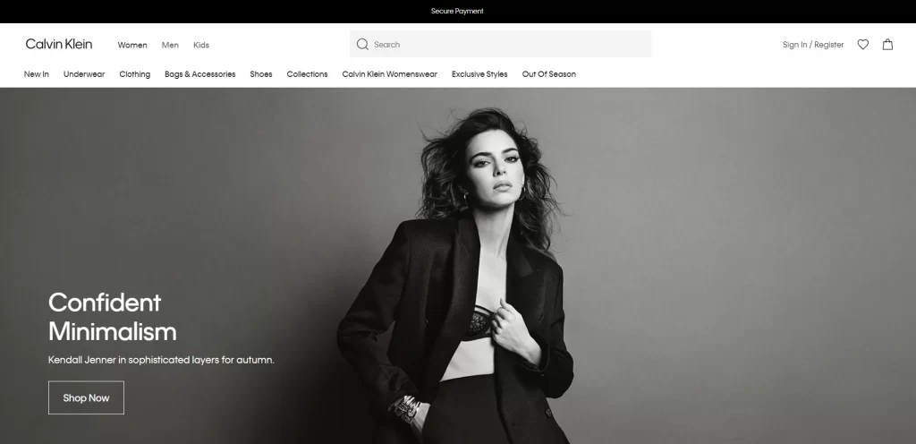
Calvin Klein’s website is a perfect example of a website design that is in tune with the brand aesthetic. Known for its simple monochromatic designs, the brand chose a clean, uncluttered UI design with a minimal black-and-white photo in the background.
2. Consistent color scheme
It’s not a disaster if you decide to break the three-color design rule and choose a more diverse color palette. As long as the shades complement each other, look harmonious together, and are present throughout the brand design, any color scheme works. It can be a 5-shade palette of muted colors, a sleek duo-chrome black and white color scheme, a fun vibrant 3-color palette, or anything in between.
If a brand is famous for using a specific shade (like Duolingo’s Feather green), it would feel odd if the background color was a completely different shade. The only exceptions to this rule and white and black, since these are universally convenient basic shades.
3. Non-distracting
As we’ve already mentioned, a user visits your website to find something they need, not to drool over your UI design and leave. That said, a background needs to be appealing enough to make the design look good but not too intense. A backdrop shouldn’t be so in-your-face it makes the user’s attention drift away from sections and buttons that actually matter.

4. Immune to resizing
A background picture that isn’t properly optimized for all devices and gets distorted is a major UI screw-up. Ideally, a background image has to be big and crisp enough to handle zoom-ins and screen rotations without getting all blurry and pixelated. On top of that, it has to account for different devices and adapt to various viewing settings to provide an equally smooth viewing experience to mobile and desktop users.

An image that gets awkwardly cropped, weirdly stretched, or otherwise distorted when viewed on a device other than a desktop is an unforgivable UI mistake.
Types of simple backgrounds
Luckily, simple doesn’t mean completely stripped of any design elements. While solid single-color backgrounds are the most popular option for UI design, there are many other options that can be just as minimal and effective.
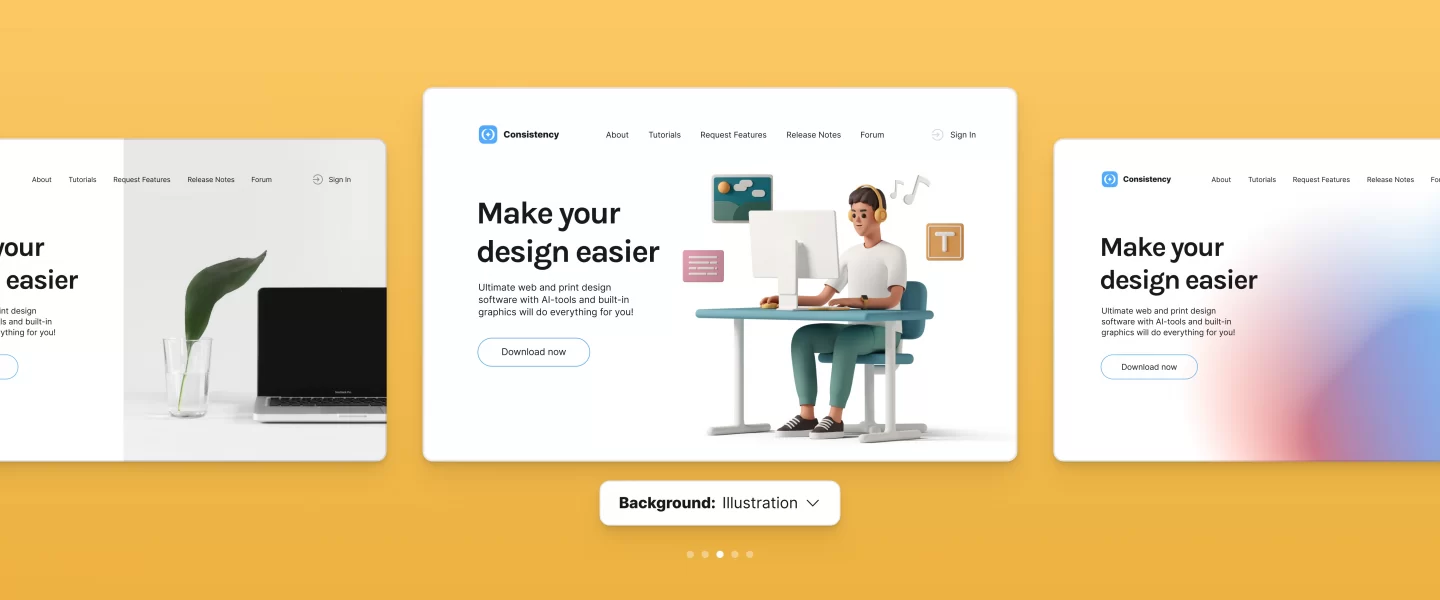
1. Gradients
Gradient backgrounds are basically solid monochromatic backdrops with a twist. Gradients create a subtle, visually pleasing color play that makes the entire design appear more sophisticated. Some gradients use different hues that intertwine delicately, while the others use a simple monochromatic lighter-to-darker shade transition.
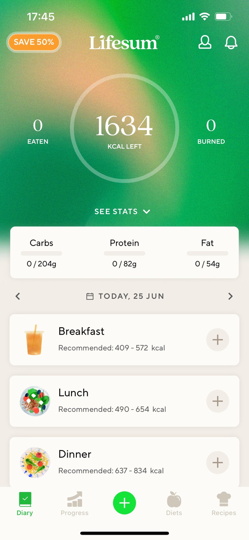
Soft color shifts are an infallible design choice, no matter the industry. Gradients work well both with mobile apps and desktop websites.
You can create your own simple gradient background in a matter of seconds using Mega Creator – a quick and intuitive online graphics editor.

2. Flat illustrations
Depending on what a company does, a flat illustration can be an impeccable choice of an app or website background. Backgrounds with illustrations generally appear less formal and more inviting. With minimal flat illustrations, you can add micro-animations to your UI design to make it more interactive and visually appealing.
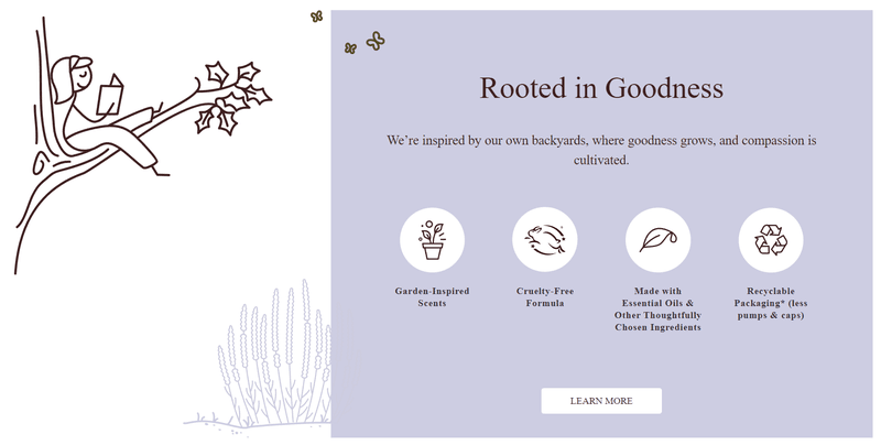
The range of flat illustrations that can be featured in UI design is endless. Some of the most popular themes include floral patterns, 2D humans and animals, and landscapes.
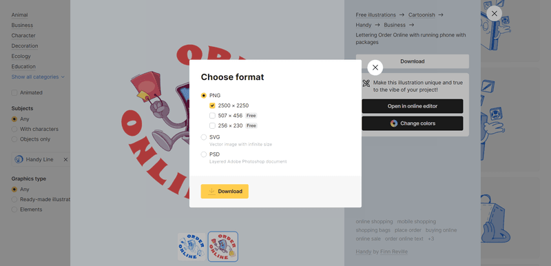
If you want to add ready-made high-quality flat illustrations to your design, you can find thousands of free images in the Ouch! library.
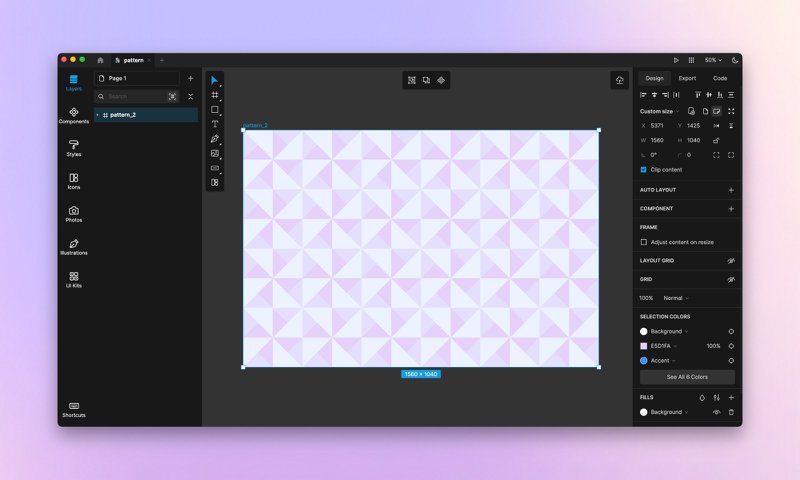
3. Geometric patterns
Geometry can be incredibly versatile and allow you to create both plain monochromatic designs and hypnotizing complex patterns. Abstract geometry makes beautiful, timeless background images that are easy to integrate into almost any UI design. Circular shapes and wiggly lines can make a design more playful and friendly, while straight lines and angular shapes add a pinch of seriousness.
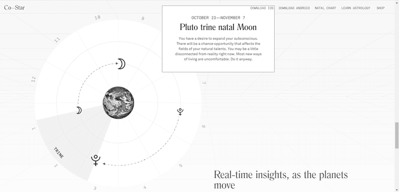
By adding color, textures, outlines, and asymmetrical shapes, you can make a geometric background look more dynamic.
To create a mesmerizing abstract geometric backgrounds, you can use Lunacy – a free offline graphics editor that works natively on Windows, macOS, and Linux.
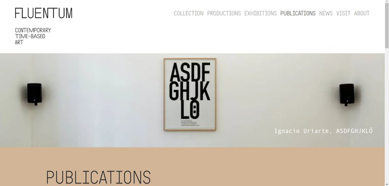
4. Photos
A high-resolution professional photo instantly elevates any website design and makes it look more expensive, tasteful, and professional. Though they might get tricky to optimize mostly because of their size, photo backgrounds are 100% worth it. They are irreplaceable for interior designers, photographers, fashion designers, and other creatives and businesses.
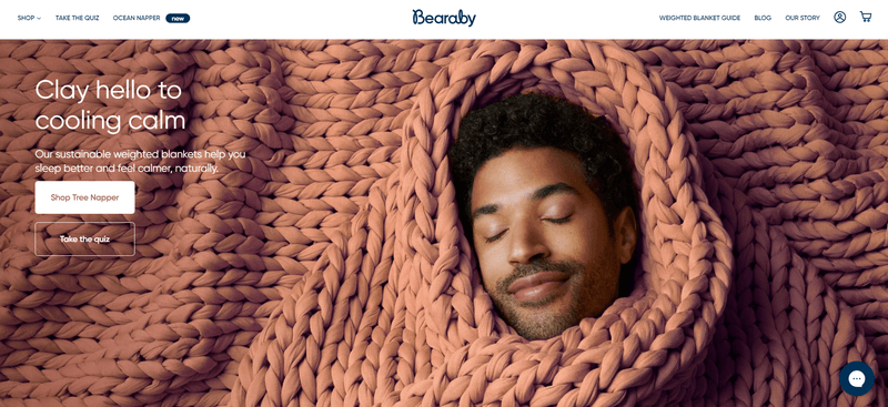
A minimalist stock photo can be an amazing way to make any website or app design feel more chic and sophisticated. You can find plenty of those in the Moose photo library. Moose has thousands of clean high-resolution pictures that are ideal for backgrounds.
5. Solid color
You can never go wrong with the good old solid monochromatic background design. A single-color background is perfectly universal, non-irritating, easily loadable, and effortlessly resizable.
A solid, monochromatic background is a safe option, but it doesn’t mean you can’t get creative with it. Solid colors can be bold, vibrant, and unique. Using a pastel or a less common shade than navy blue will make a website stand out.
Choosing the right background
Simple doesn’t always mean boring and there are endless ways to make a minimal design eye-catching. When designing a background for your app or website, keep in mind that it should be:
- on-brand
- consistent
- non-overbearing
- appropriately sized
If your background checks all these boxes, chances are your design is good to go. In case you’re not sure what you need and where to start, there are numerous image libraries to help you in your search for the perfect picture: Moose, Adobe Stock, Shutterstock, and more.
Finally, don’t forget to look through other apps and websites for design inspiration.