


Learn how to get spacing, sizing, and alignment right to make your icon both legible and usable.
Designing an icon that works is trickier than it might seem. Users rarely obsess over perfect UI icons, but they never fail to notice poorly designed ones. A good icon should be recognizable enough to help a user make sense of the interface and simple enough to keep the UI clean. Plus, the icons within the same interface should be consistent style- and size-wise. Most importantly, each image is supposed to fit within a tiny square: interface icons can be as small as 16×16 pixels or as big as 256×256 pixels depending on the environment. Check out our guide on icon sizes to learn more.
That said, creating a pack of custom icons can be too time-consuming, and designers often opt for ready-made icon packs. While this is a solid solution, sometimes you just need to make your own icons. Whether it’s because your UI style is too unique, the icons you need are too niche, or you are feeling particularly ambitious, some designs call for custom icons. Here is our guide on how to make a solid icon without losing your mind trying to follow all the UI design principles.
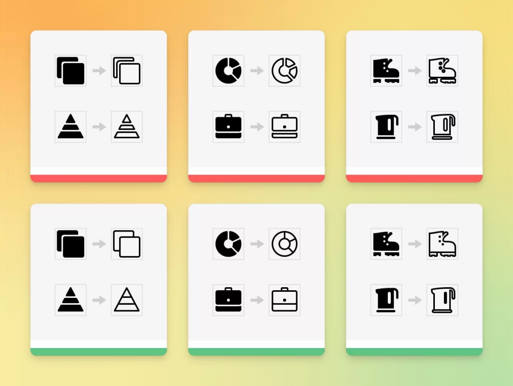
Drop unnecessary outlines
Avoid adding excess spacing when you draw outline icons. It can make your icon appear more cluttered and reduce the recognizability of an object. This eventually makes it more difficult for the user to navigate the interface.
This often happens when creating outline icons based on solid icons. Sometimes, designers simply change the style from fill to outline, forgetting to clean up the result. This can be particularly painful when an icon contains both solid and outline elements like the kettle in the example below.
Choose the correct level of detail
Icons should facilitate the user’s interaction with the interface, complementing or replacing text if necessary. Adding too few or too many details can make it harder for the user to identify the images and interact with the interface. When designing an icon, you always need to think of the tasks the interface needs to accomplish.
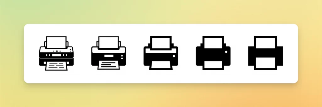
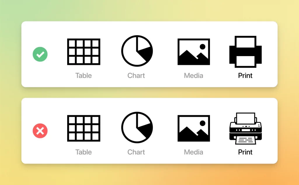
For instance, an icon representing a printer on the toolbar of a text editor is solely intended to distinguish it from other objects such as tables, graphs, and images. This is why there is no need to go for a nearly photorealistic image of a real printer model — a simple minimalist icon would be just enough.
Needless to say, you should stick to the same level of detail within a single interface. An excessively detailed icon looks completely out of place among minimal icons and vice versa.
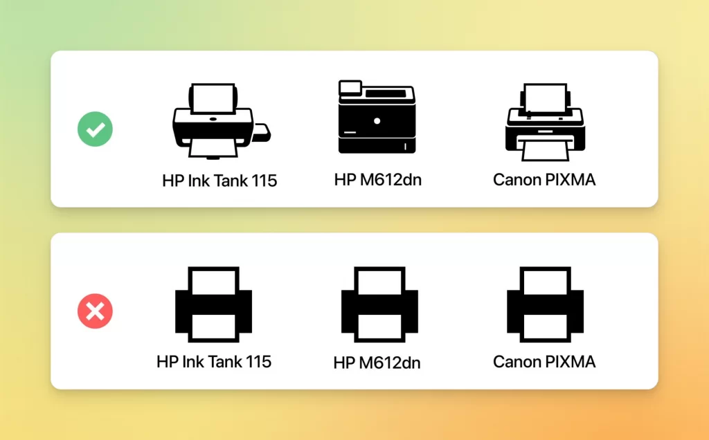
However, if we needed to offer the user multiple different printer models to choose from, we would need to make the icons more elaborate and lifelike. They are still not overloaded with details, yet perfectly clear and distinguishable.
Display a portion of an object for visual balance
An icon is a tricky image type that doesn’t allow much room for a complex composition. Everything should fit within a square, so going for a horizontally or vertically stretched image will add unnecessary white space and make your icon appear smaller and less readable. You can overcome this tricky issue by showing only a segment of an object.
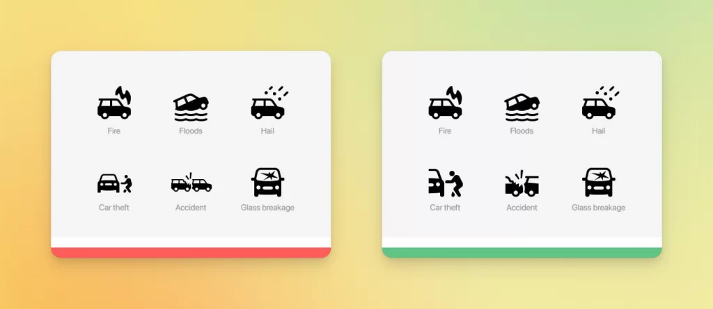
Here is an example showing car insurance-related icons. Let’s look at the Car Theft and Accident icons. If we have full cars, the icons instantly look smaller than the rest. By showing only a part of each of the cars, we increase their angular size, making the whole icon set look even.
Angular size is a way of measuring how big something looks to you when you see it. It’s not the same as the actual size of things because objects that are far away look smaller than those that are close to you. For example, a car that is parked next to you looks bigger than a car that is on the other side of the street, even though they are both the same size.
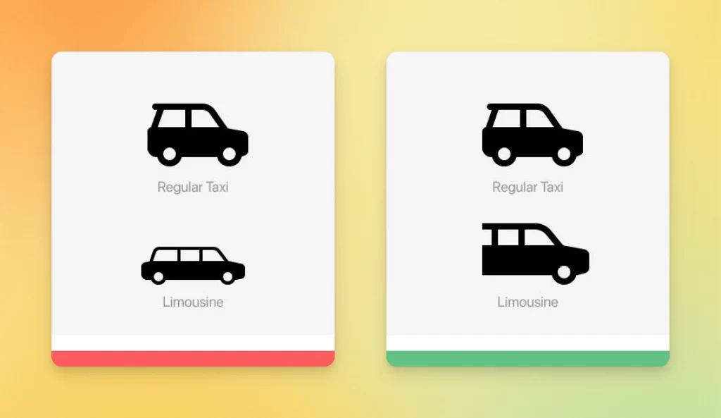
Here are some more examples of this visual trick:
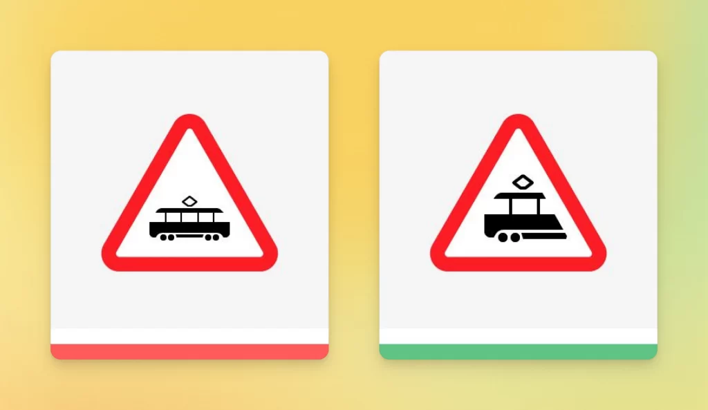
You can use the same trick to avoid leaving too much white space in your icon. Displaying a portion of an object can balance out the composition and increase its readability.
In the example below, you can see how clear and harmonious the road sign looks with just a portion of the tram left in the picture.
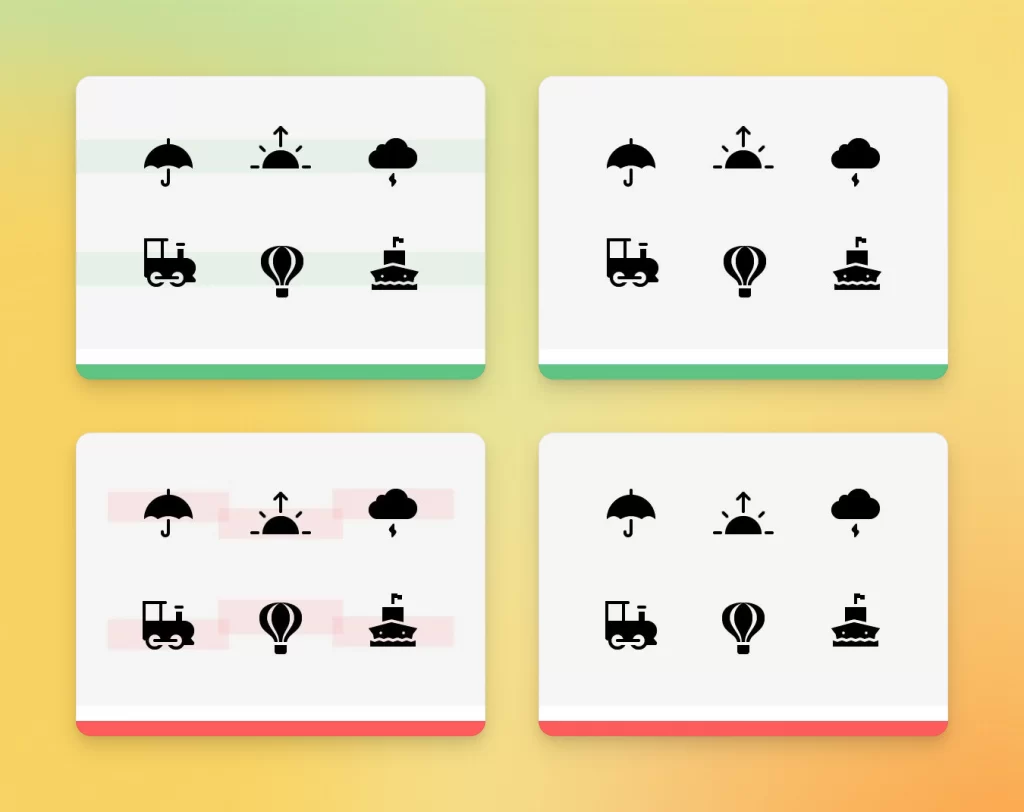
Align complex objects based on visual weight
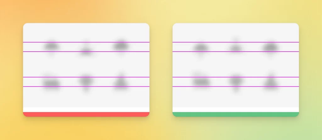
It is easy to align icons that are based on simple geometric shapes — squares, circles, rectangles, etc. The challenge comes when the shape of an icon is not as straightforward. In this case, aligning icons by creating equal margins between their boundaries may not guarantee you perfect spacing.
Protruding elements that have a small visual weight should not be taken into account when aligning the icons. It is better to focus on the main object, placing it as close as possible to the center of the icon.
The same rule applies when aligning several objects relative to each other. In the example below, we placed the triangle right in the center of the circle. However, because the left half of the triangle is much heavier visually, it appears off-center. By moving the triangle to the left, we made a perfectly symmetrical Play button.
Tip: if you squint, the alignment flaws of blurred objects on the left become more obvious.
Sometimes we can intentionally break this rule so that the positioning of an icon hints at its function in the interface. A perfect example of a case like this would be icons for moving rows in a table.
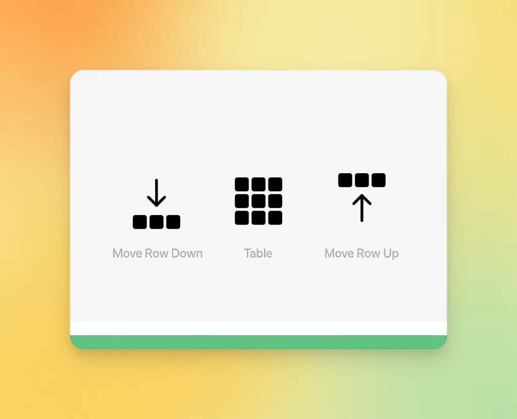
Use negative space
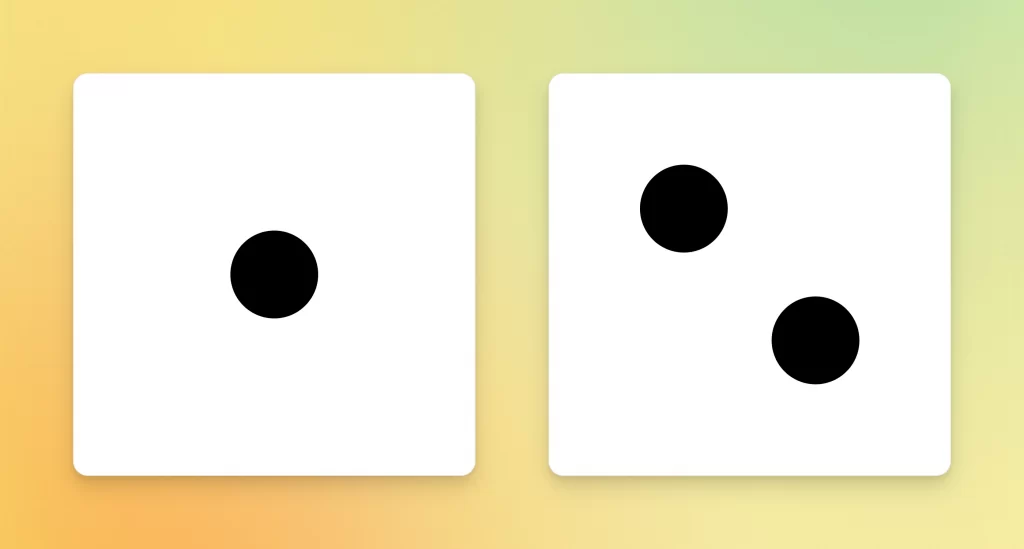
Negative space refers to the part of a plane around and between the lines. Despite being technically unoccupied, it visually functions as a design component.
Let’s take a look at what negative space does when we draw basic shapes on a white background. When it’s a single circle, it appears to float freely in space or lie flat against the backdrop (depends on how you look at it). But if you add another circle below and place it in the opposite corner, it looks like one of them is ascending while the other one is descending.
With negative space, you can add unexpected Easter eggs or hide a deeper message inside a single image. By using negative space, you eliminate unnecessary details and declutter the composition while keeping it clear and legible.
Here are a few examples of logos that use negative space masterfully:

You can find some more inspiring examples of negative space icons here:


Creating a set of perfect icons
Making icons for your design project from scratch can be beyond exhausting and time-consuming. There is no need to waste your precious time figuring out how to make icons that would look good in your UI — you can find ready-made sets of consistent icons in the Icons8 library. Solid or outline, black-and-white or colored, minimal or quirky — we have plenty of styles to choose from. And yes, all of them were made in accordance with the principles we discussed in this article. There is no need to worry about readability, usability, or resizing issues: your perfect graphics are a click away.